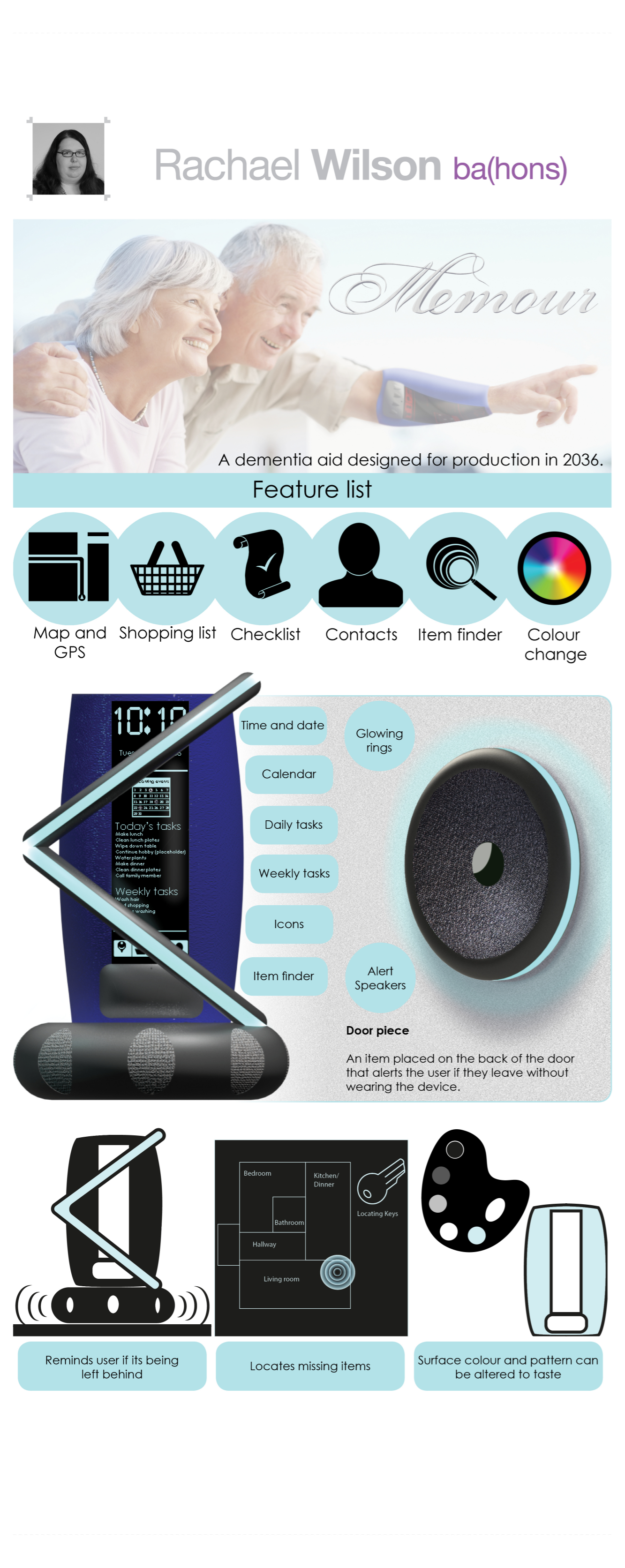
MEMOUR
The memour is one of my 2 projects for third year. The other being the Rado. This is a futures project designed to be manufacturable in 2036/37 which is 20 years after the project took place. As it is a futures project, what technology will be actually availble is impossible to predict accuractely as the technology being developed improving exponentially.
The starting point for this project was connected to Vtech and their three 'Cs' of Care, Communication and Connection. We were each given one of three 'Cs' which for me was care. I focused on an aid for sufferers of dementia. The brief I created was:
To design a product to support dementia sufferers so they can remain independent in their own home for longer.
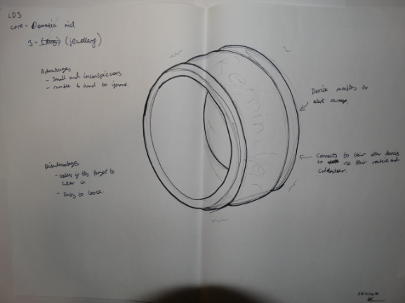
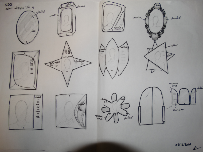
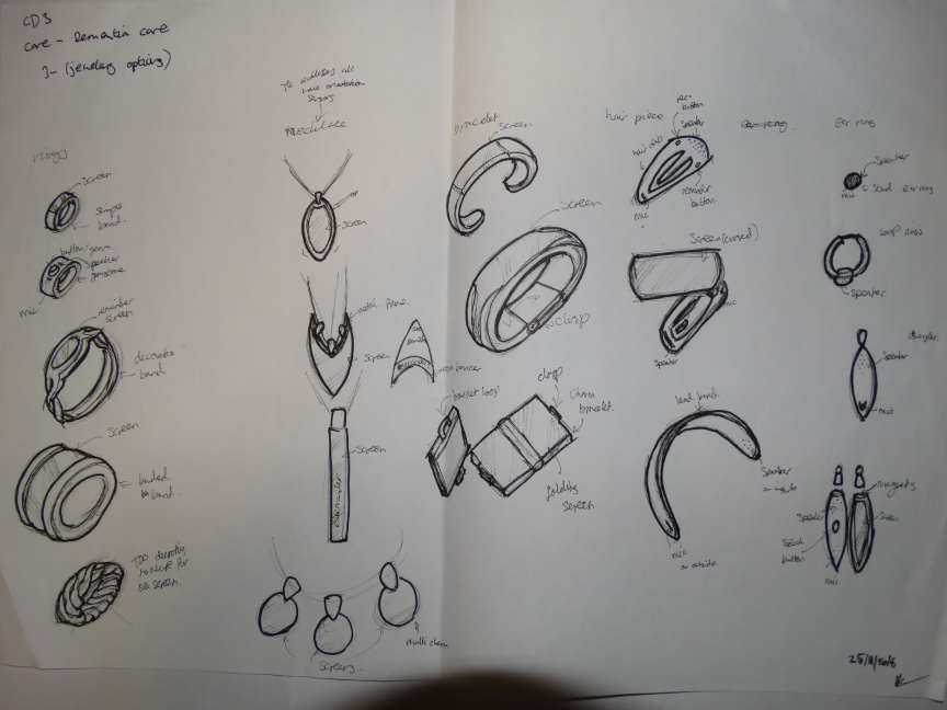
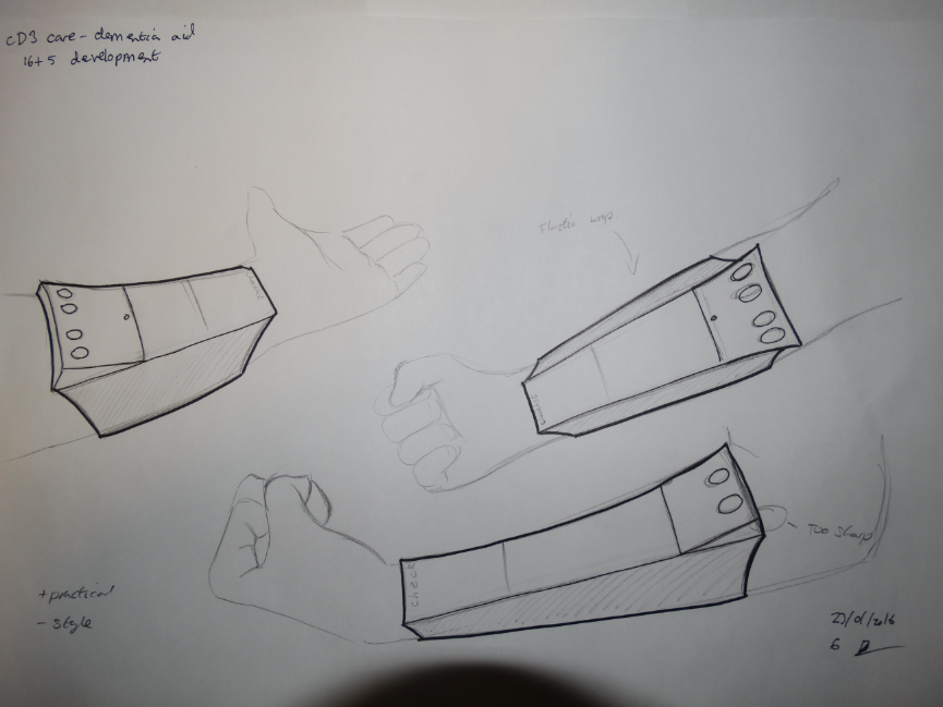
Example initial sketches
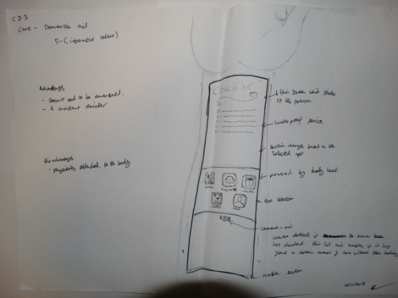
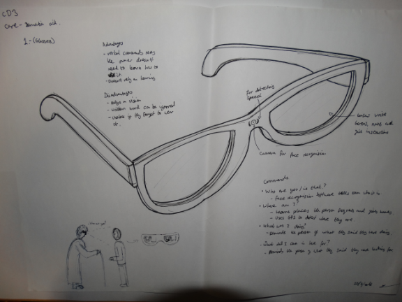
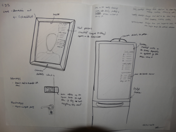
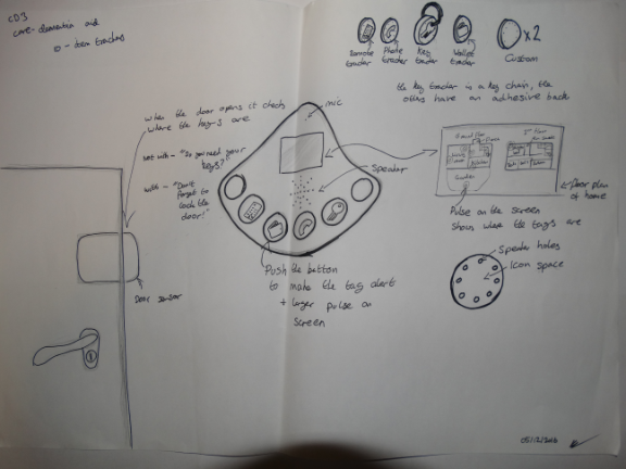
The first step of any design phase is the initial sketch work and concept generation. Below are a few exampled of these intital concepts, the first of which eventually becomes the final product. These products are supposed to remind the dementia sufferer of tasks they are meant to fulfill, not do them without the user's input. This is because research into dementia suggests that the condition progresses slower if the sufferer does things themselves.
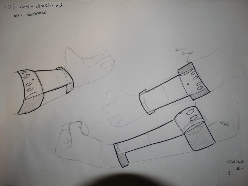
First Stage Development
Concept projects, especially futures ones like this are mostly form and function projects. As such these developments are mostly just surface stylizing and appearances.
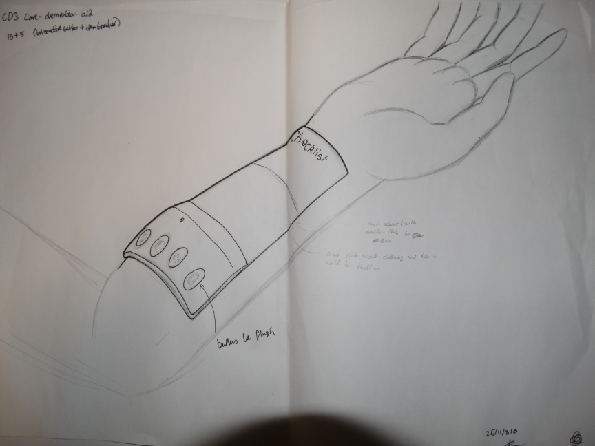
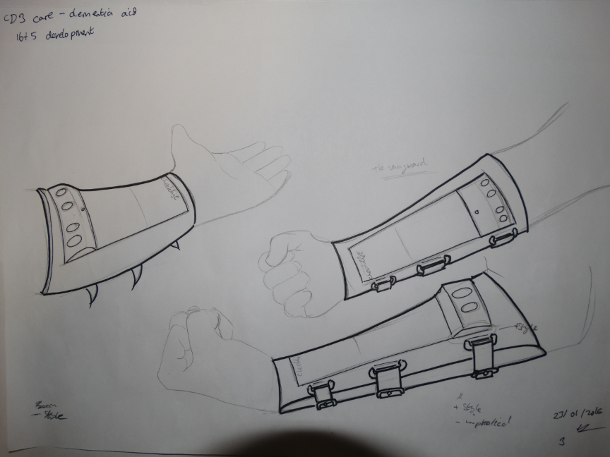
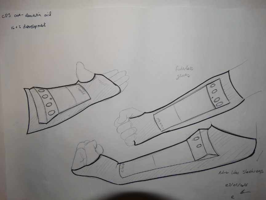
Second Stage Development
The first idea was taken for further development. This stage focuses on how the product would faster to the user's arm.
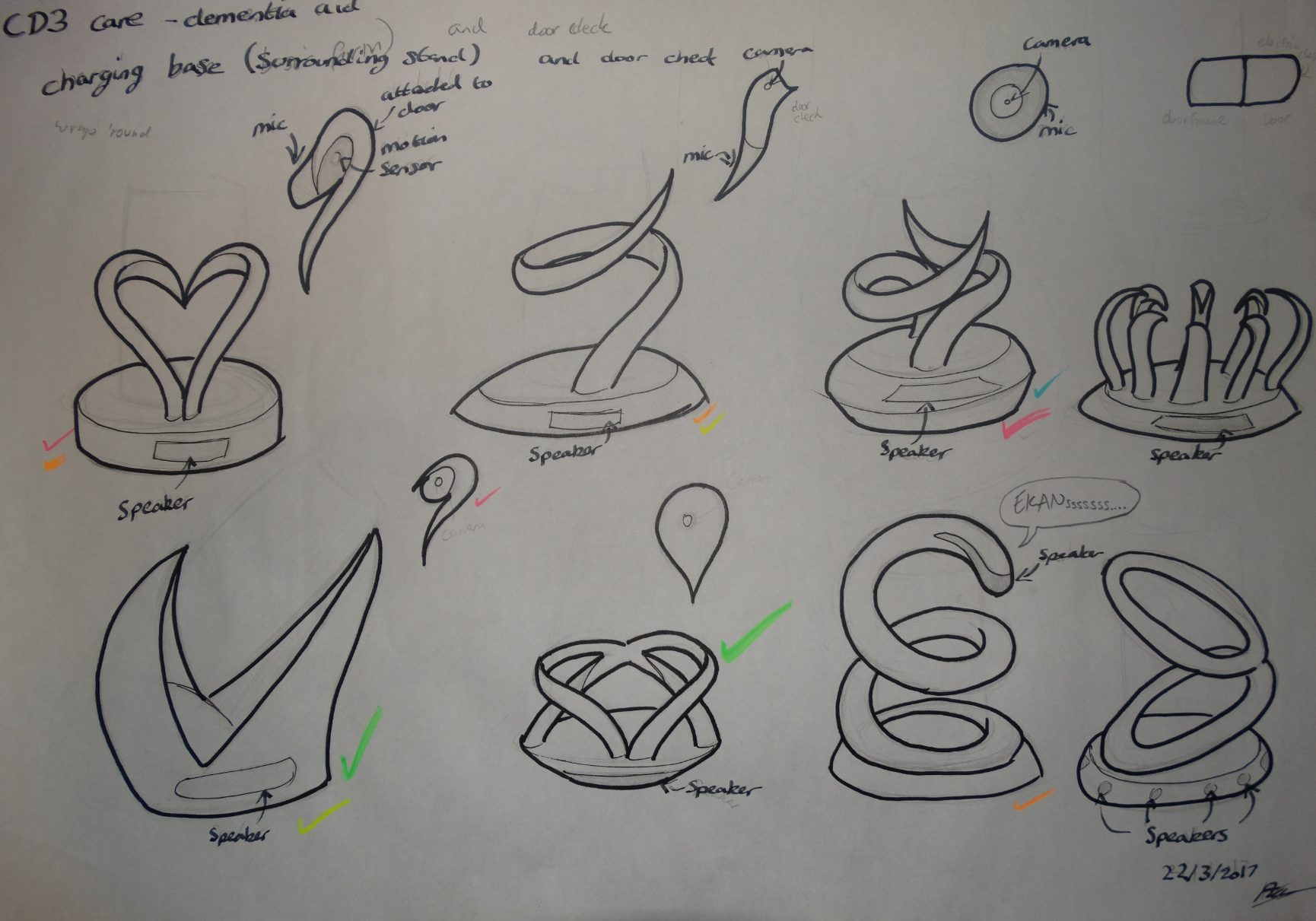
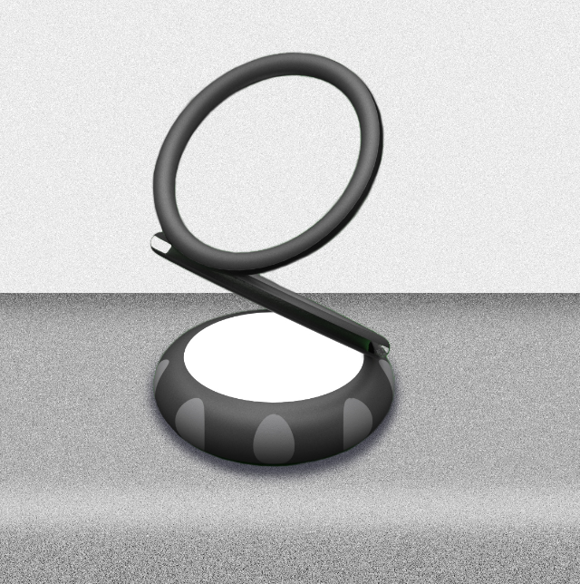
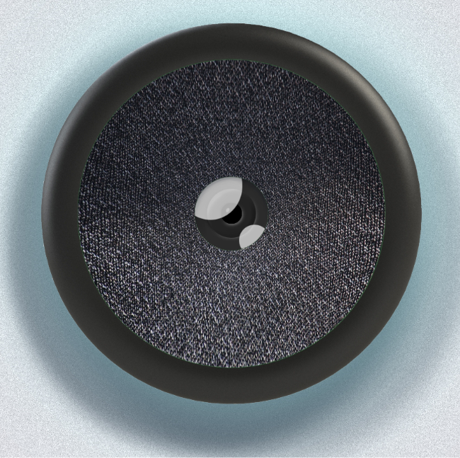
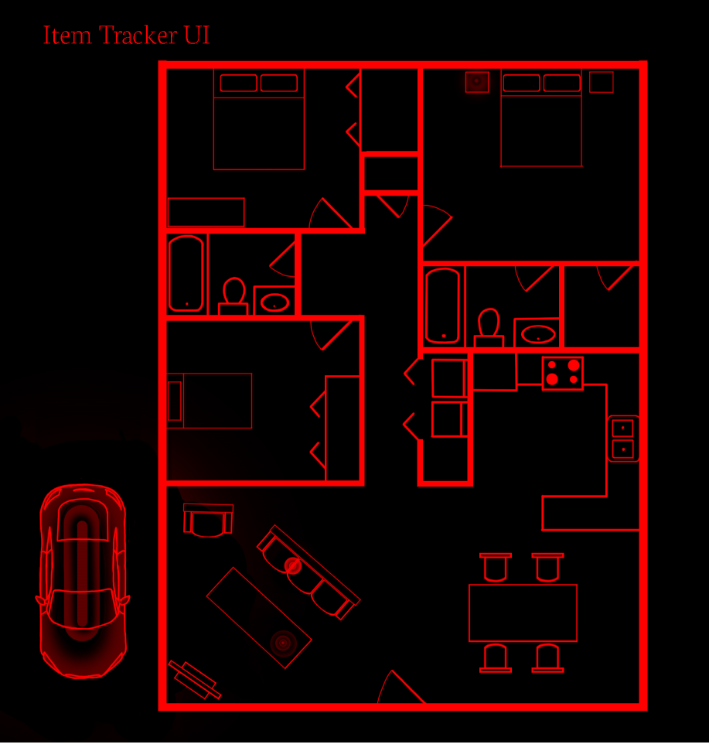
Additional parts
This product doesn't really work as a stand alone item. It ony works while the user is wearing it so part of the product need to remind the user to put it on in the morning and a place to put it at night so they can find it in the morning. This was done in two parts, one that acted as a charging stand and the other as a wall mounting to alert the user if they are about to leave the room or home without it, depending on placement.
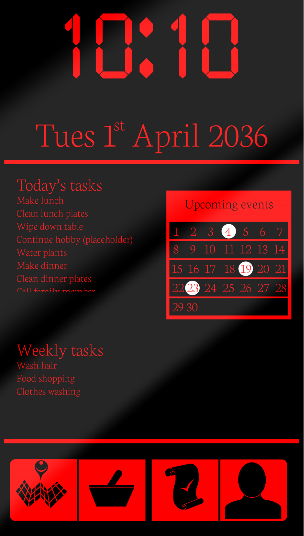
UI Design
Technology like this needs to be simple to understand for the user. This is especially true for a product that supports dementia suffers as they may need to relearn how to use the product everytime they wear it. Research into the elderly's ability to see shows that red is the colour least effected by colour vision decay that occurs at old age and that serif fonts are easier for them to read so these would be used as defaults. That being said, it would be possible to change the colour and fonts on the device if the owner wanted.
Banner
This was the banner displayed at the degree show at the end of the year. The UI appears as a pale blue for colour consistancy in the banner.